Since its introduction, Syndeia has supported Model-Based Engineering (MBE). Syndeia has enabled users to create connections between models in different tools and to use those connections to compare and update those models, but it has only displayed the connections in simple tabular formats. Syndeia 3.0 provides some important new options for visualizing the model connections.
Two types of visualization are offered:
Watch a quick video introduction to the visualization capabilities in Syndeia 3.0.
In Part 1 of this blog series, we will look at some of the features for Global Visualization. Later blog posts will introduce aspects of Local Visualization, as well as the continuing evolution of this capability as Syndeia grows.
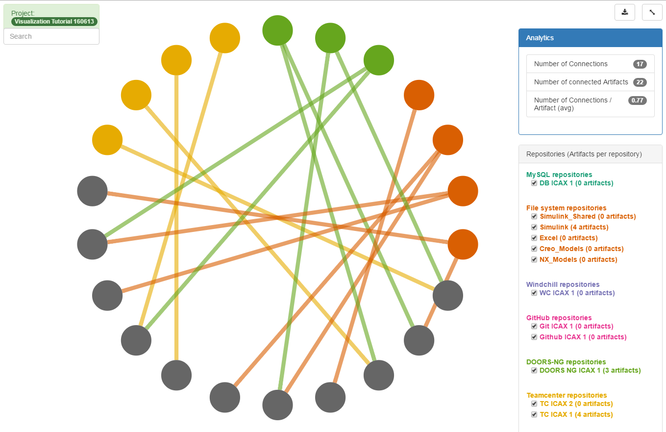
Figure 1 displays seventeen connections between a SysML model and three external engineering software tools: Teamcenter (Siemens), DOORS NG (IBM Rational), and Simulink (The MathWorks Inc.). Each color-coded node around the circle represents an element in one of those four models:
This visualization was created by right-clicking on any element in the SysML model (browser or diagram) or the Syndeia dashboard and selecting Syndeia → Visualize → View All Connections. The graph display opens in the user’s default web browser.
Global Visualization provides a quick overview of key MBE data for the graph:
and how the complexity of the graph evolves as the system develops.
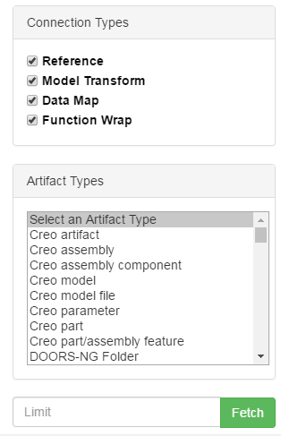
As the number of connections grows, the amount of information displayed can quickly become overwhelming. Syndeia offers a filter capability to reduce display complexity (Figure 2). The user can filter by node (what type(s) of model element to display) or by edge (what kinds of connections to display). Syndeia supports multiple connection types:
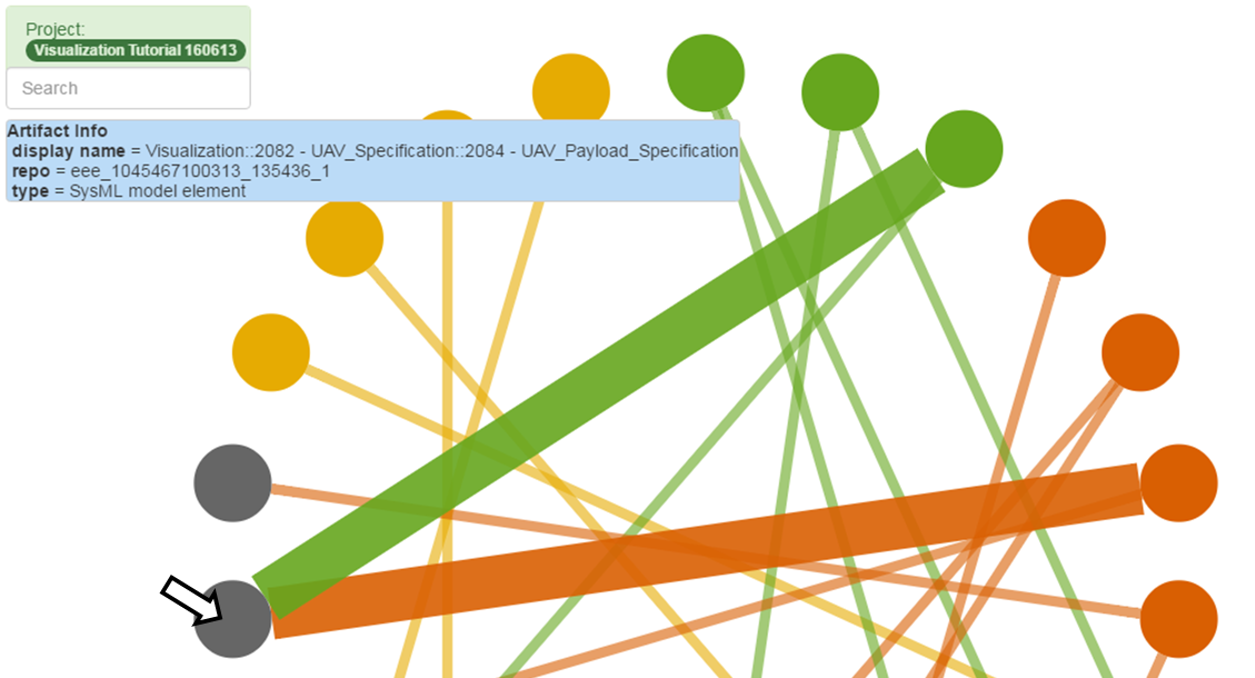
In addition to filtering, Syndeia’s Global Visualization also allows the user to highlight and examine the individual nodes and edges. When hovering the cursor over a node, as shown in Figure 3, the blue box in the upper left corner identifies the model element represented by the node and the connections from that node. Those connections are also highlighted on the graph with thicker lines. Similarly, hovering over a connection identifies the nodes connected.
It is worth noting the following:
In Part 2 of this blog series on Syndeia Visualization, we will look at some options for tracing connections from a specific starting node, allowing a user to focus in on the other model elements (within or across models) that impact the specific node, or that may be impacted by changes in that node.
Related blog posts: